Watercolours by Dante Gabriel Rossetti
Colour Materiality
1856
Dante Gabriel Rossetti was working separately from his Pre-Raphaelite ‘brothers’ John Everett Millais and William Holman Hunt by the mid 1850s and through the 1860s. He worked in several media over his lifetime but at this period mainly on paper or parchment rather than canvas, making small-scale, intricate, and colour-filled designs of mediaeval figures in interiors as well as highly detailed designs in black ink on creamy parchment.
The small watercolour The Wedding of St George and Princess Sabra 1857 is a highly coloured and detailed depiction of an imagined mediaeval interior, filled with richly decorated fabric, highly-polished golden armour, expensive objects, and a brilliantly coloured green dragon. It was painted in transparent watercolour and opaque gouache, over a very detailed drawing in graphite pencil, on smooth cream wove paper, lined with more paper attached to canvas on a rather expensive-looking stretcher. The colours are dense and brilliant, and Rossetti must have used the newly-available tube watercolours in order to achieve such rich tones with relatively thin layers. As in his earlier paintings, he used pure and unmixed colours in some areas, to obtain the greatest depth of colour, over a white preparatory layer, here made of bluish-white zinc white, and very thin. He used extremely small brushes to apply fine detail onto the ornate fabrics, employing red or purplish red earth pigment, bright red vermilion, yellow ochre, chrome yellow, emerald green, cobalt blue, with shell gold made from genuine powdered gold for the halo. Most of these would still be expensive colours in watercolour in 1871, costing up to five times as much as the traditional yellow and brown earth colours he also used. He scratched through to the paper with a fine needle or similar instrument, to create some of the lights.
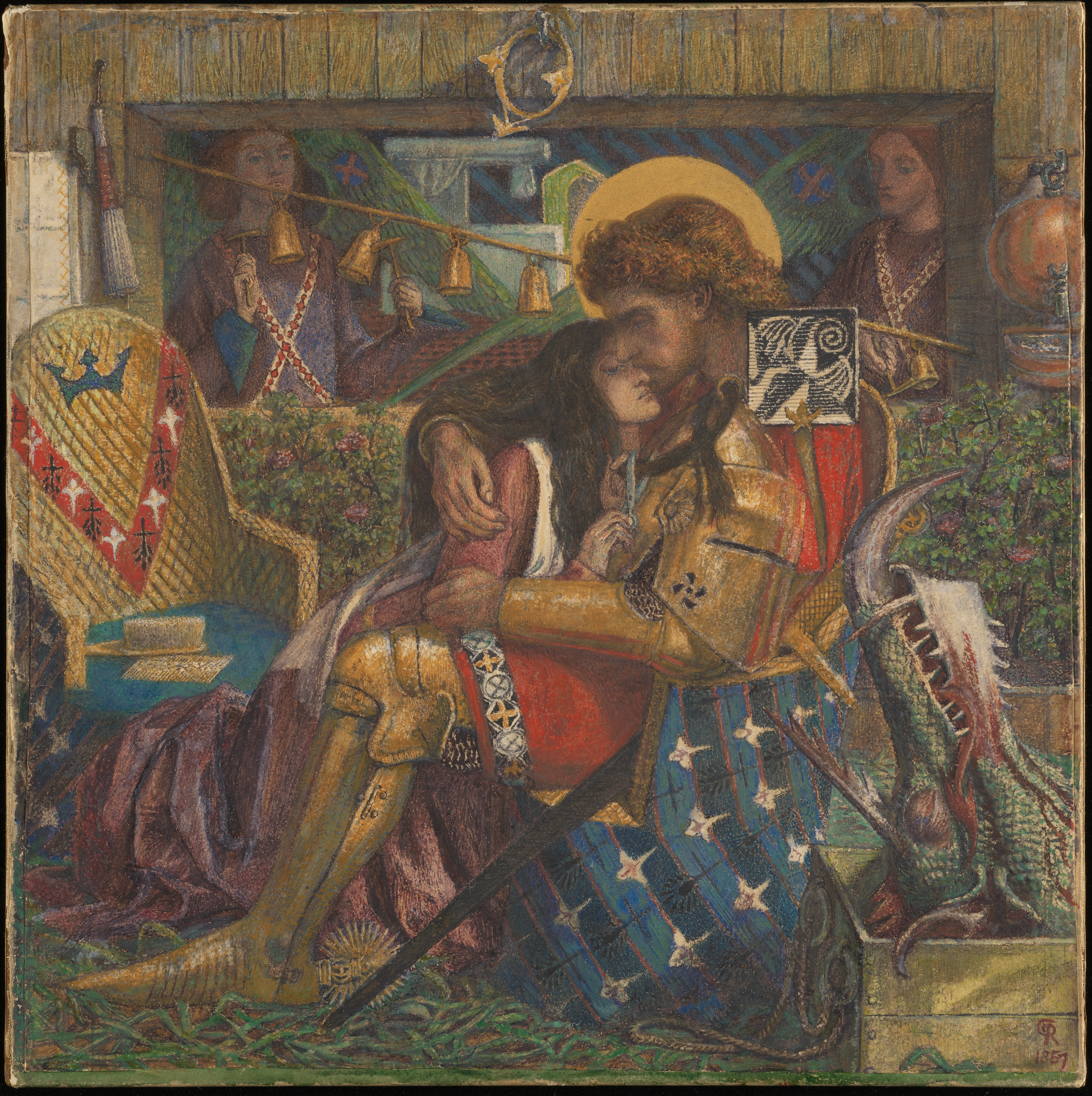
The Tune of the Seven Towers 1857 contains a similar wealth of carefully planned and applied detail in its mediaeval setting, but with large areas of deep emerald green and reddish blue. It is on smooth cream paper on a comparable stretcher to The Wedding … . Rossetti used purplish red earth, vermilion, yellow ochre, chrome yellow, emerald green, cobalt blue and possibly prussian blue, umber and likely other shades of earth pigment, with zinc white for some white areas, and fine scratching out to create white details and highlights, again applied over a detailed drawing in graphite pencil. He made some colours more glossy with gum brushed on top. Again his brushes were very small, but here for the deep green and blue fabrics he applied fine diagonal brushstrokes known as hatching, using at least two distinct colours and separate brushes for each, which enabled him to model the fall of the heavy fabrics accurately. This work is more complex and ingenious in its construction than The Wedding … . Either he worked in a very good light to paint such fine details, or he used a magnifying device.
Even a decade earlier the colours used in watercolour by Rossetti would have been an unusual choice for the medium, with the exception of that great innovator, J.M.W. Turner, who first expanded the watercolour palette with the newest and most vivid colours. In fact, Rossetti employed a very similar palette in his oil paintings too.
Bibliography
-
Grieve, Alastair, The Art of Dante Gabriel Rossetti, Part III: The Watercolours and Drawings of 1850–1855, Real World, Norwich, 1978.
-
Grieve, Alastair, The Art of Dante Gabriel Rossetti: The Medieval Subjects of 1855–58, Real World, Norwich, 2010.
-
Jacobi, Carol and James Finch (eds), The Rossettis, London, Tate Publishing, 2023.
-
Townsend, Joyce H., ‘Paintboxes, palettes and colours in an industrial age’, in How Turner Painted: Materials and Techniques, London, Thames and Hudson, 2019, pp.108–119.
-
Townsend, Joyce H., ‘Watercolours by Elizabeth Eleanor Siddal’, Chromobase entry, 2025.